Pantone Announces the Spring Color Trends for 2023
posted by Ben on October 24, 2022
// Comments Off on Pantone Announces the Spring Color Trends for 2023
Pantone Announces the Spring Color Trends for 2023
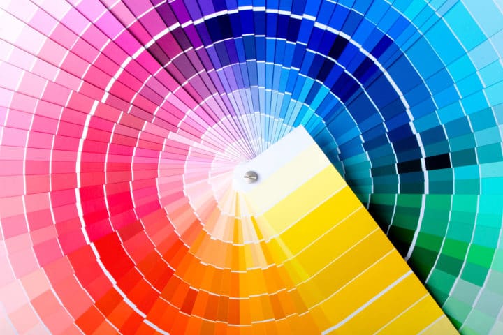
When the Pantone Color Institute team started thinking about the color trends that will rule in the spring and summer of 2023, they were aware that the 15 hues they highlighted would have to speak to rejuvenation and reemergence after a long, frigid winter.
The Institute used contrast as a guiding principle to put together this palette, which was also based on new fashion trends. Leatrice Eiseman, the executive director of the Pantone Color Institute, said in a news statement that the colors for 2023 Spring and Summer underwent recalibration for the newly approaching period.

Image from Depositphotos
New Classics
The design team chose to lay the framework for the contrast with five “neutral” hues; these calming tones stand in for a “silent presence.” This section of the color trend report symbolizes its “utility and basicness.” It is supported by Pantone 12-4604 Skylight, a pure, water-inspired color that reflects purifying blue, and Pantone 13-3804 Gray Lilac, a “dreamy and ethereal lilac-infused gray.”
5 New Classics from Pantone:
- Pantone 12-4604 Skylight is a clear, refreshing aqua.
- Pantone 13-3804 Gray Lilac is a lilac-infused, lovely, ethereal gray.
- Pantone 12-1009 Vanilla Cream is a soft and sweet creamy tone.
- Leek Green, Pantone 15-0628, is a vegetable green with a delicate taste.
- Pantone 17-1221 Macchiato is a delicious brown with a thin foam layer.
Go Red Before Bed to Sleep Better
Vivacious Brights
The “uplifting, energetic feeling of play that exudes through” the color scheme is indicated by the remaining ten tones. The purpose of choosing vivid colors is to encourage experimentation and expression. For instance, Pantone 14-0756 Empire Yellow symbolizes happiness, whereas Pantone 18-1664 Fiery Red denotes vigor. For more insight on the latest fashion trends, please check out TheLooks website.

Image from Pixabay
Spring/Summer 2023 top ten standout Color Palette:
- Pantone number 18-1664 describes Fiery Red as “a hyper heated red tone suggesting an intense intensity.”
- Pantone 18-2143 Beetroot Purple is an intense fuchsia color representing the natural world's bounty.
- Pantone 15-1335 Tangelo: Tangy, delicious, vitamin-rich oranges
- Pantone 15-1530 Peach Pink: A comforting peach tone welcomes you in for a cozy hug.
- Pantone 14-0756 Empire Yellow is a gleaming yellow that exudes enthusiasm.
- Pantone 12-1708 Crystal Rose is a transparent pink that conveys contemporary romanticism.
- Pantone 16-6340 Classic Green is a wholesome green with health-promoting properties.
- Pantone number 13-0443 Love Bird is a vibrant, exotic, green plant.
- Pantone 16-4036 Blue Perennial is a striking blue that enlivens the color scheme.
- Pantone 14-4316 Summer Song is a calm blue shade that conveys tranquility and leisure.
In the end, combining these colors in your clothing or other areas of your house gives you the flexibility to attempt something new. The press statement from Pantone claims that this “quirky contrast” emphasizes the quest for individuality and encourages people to express themselves in unexpected ways.
Color Style and Accessories: Popular Hair Trends
Report on Fashion Color Trends
Pantone Fashion's Home + Interiors Color System, the most extensively used and respected color standards system for fashion, textile, home, and interior design, is the source of the colors included in the semi-annual Pantone Fashion Color Trend Report.
The Pantone Fashion Color Trend Report, which highlights the top colors you can anticipate seeing at New York Fashion Week and London Fashion Week, is published every season as a semi-annual color trend forecast for the forthcoming season. Retailers, businesses, fashion enthusiasts, and journalists may use the Pantone Fashion Report as a color reference all season long.
What is the Pantone Color Institute?
Pantone Color Institute is a commercial section inside Pantone that chooses the Pantone Color of the Year, anticipates worldwide color trends, and offers business advice on color for products and services.
The Pantone Color Institute works with international companies to successfully integrate the power, psychology, and emotion of color into their design strategy through seasonal trend predictions, color psychology, and color counseling. Pantone offers a global language of color that helps marketers and manufacturers to make color-critical choices at every level of the process.
Ultra Violet 11 Ways to Add Pantone's Color of the Year to Your Home
Comments Off on Pantone Announces the Spring Color Trends for 2023


